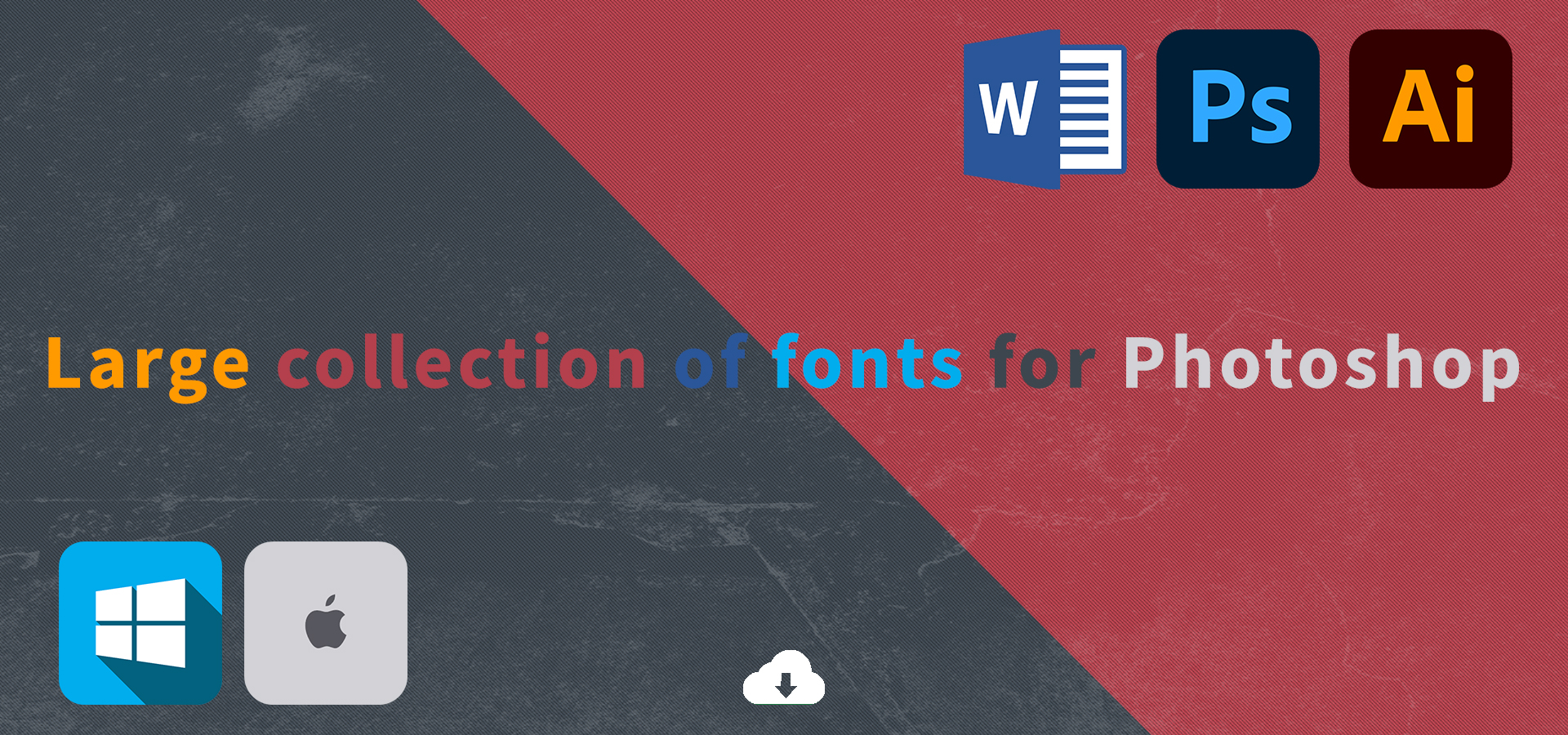
- Fontinstall scours the internet for high quality, legitimately free fonts . Download thousands of completely legal, high quality, free fonts.
Fonts
-
Choosing the right font can be confusing even for an experienced designer – not to mention beginners. The task becomes even more difficult when fonts have to be combined. The fact is that there are an almost infinite number of options available to you, and there are only a few to choose from, since you cannot really combine them all at once. In all this variety, how do you find the right font or combination that will fit perfectly into your design and help convey important information to your audience? Let s find out.
The font determines the appearance of any structure. Different types can be used both for scientific and fiction print. Or in advertising and web design. There is no limit. Each font consists of the following aspects:
• Kegel – the size that is specified in, for example, Word, or any other text editor;
• Graphical basis – different elements like strokes, connecting lines;
• The letters itself – the type of their outline - i.e., slanted or straight letters, and the saturation and color.
Of course, this is not the whole list. There are also other characteristics of fonts. For example, economy depends on the number of characters placed in a line. And hygiene is determined by readability. It depends on the speed of perception of individual characters and the text as a whole. The readability is affected by all of the font characteristics: typeface, shape, and so on. By the way, it decreases with the mitigation of the letters and the overall change in the typeface. This should be taken into account when selecting fonts for advertising printing, because the perception of the content by the recipient comes to the forefront here, and one should think about it.
- Classification of fonts
-
Fonts are classified according to various criteria. First of all, it is the graphical basis. The signs in the font may be quite different. For example, classical, narrow, wide, etc. The filling of the strokes also changes the visualization of the font. In many text editors you will find fonts with a normal, outline, or stroke accent. The variety is really great here.
There are two most popular types of fonts:
1. Serif fonts are the classics of typography. They are the earliest fonts. Serif fonts are represented as a small strokes on the edges of letters. It is generally accepted that long text in serif type is easier to read, and so is frequently used in books and other printed materials. The most popular serif typeface is Times New Roman.
2. Sans serif fonts are the more modern and bolder versions, which, as the name implies, got rid of the traditional serif. They were especially popular at the beginning of the last century as something new and bold.
- How to choose the perfect font
-
First of all, you need to understand what the purpose of your design is. What information do you want to convey? With what? In good design, typography is consistent with purpose. You should use it to make the overall conception. When it comes to a promotion with images, it is better to choose a font that matches the style of the illustrations. The font should be in harmony with the rest of the design. As well as looking for fonts, look for combinations’ ideas. The right overlaps are just as important as the fonts themselves. A harmonious combination makes for the best possible readability.
Here is a list of the most popular fonts, which are versatile enough that you can use them in almost any design scheme you want:
• Times New Roman;
• Georgia;
• Courier New;
• Clarendon;
• Comic Sans;
• Tahoma;
• Arial;
• Calligraph;
• Academy;
• Helvetica;
• Univers;
• Rockwell.